One of the arguments for having devolved bodies like Transport for the North is there are big differences between places across the country, which need to be understood to develop more effective public policies and investments.
What better way to understand the differences between places than using a map?
Transport for the North’s Technical Assurance, Modelling and Economics (TAME) team love to produce maps. Or more precisely, we love to produce geospatial datasets that help us to understand and model patterns of land-use, demographic and economic change, and travel across our region – Maps are just a great way to visualize this analysis.
Our Analytical Framework is built on the solid foundations of some great geospatial data provided by key public sector organisations like Ordnance Survey, the Office for National Statistics and the Department for Transport.
We’ve taken those datasets and integrated them together into a framework that allows us to understand the relationships between things like land, buildings, households, businesses and transport networks.
To showcase some of our geospatial data, and to learn a few new skills along the way, the team decided to take part in the 30 Day Map Challenge (search #30DayMapChallenge on social media to see more examples).
Our efforts so far can be explored here. Have a look for more insights into things such as:
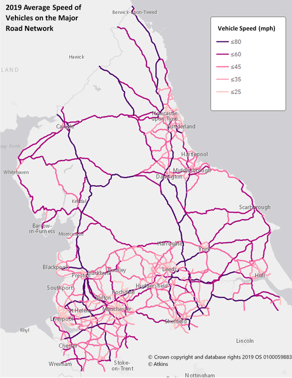
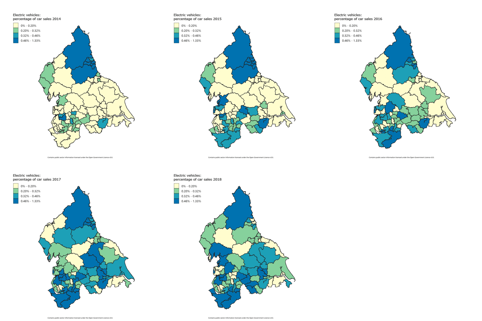
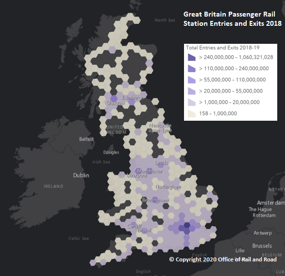
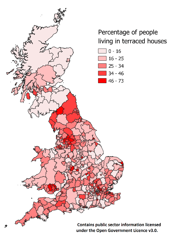
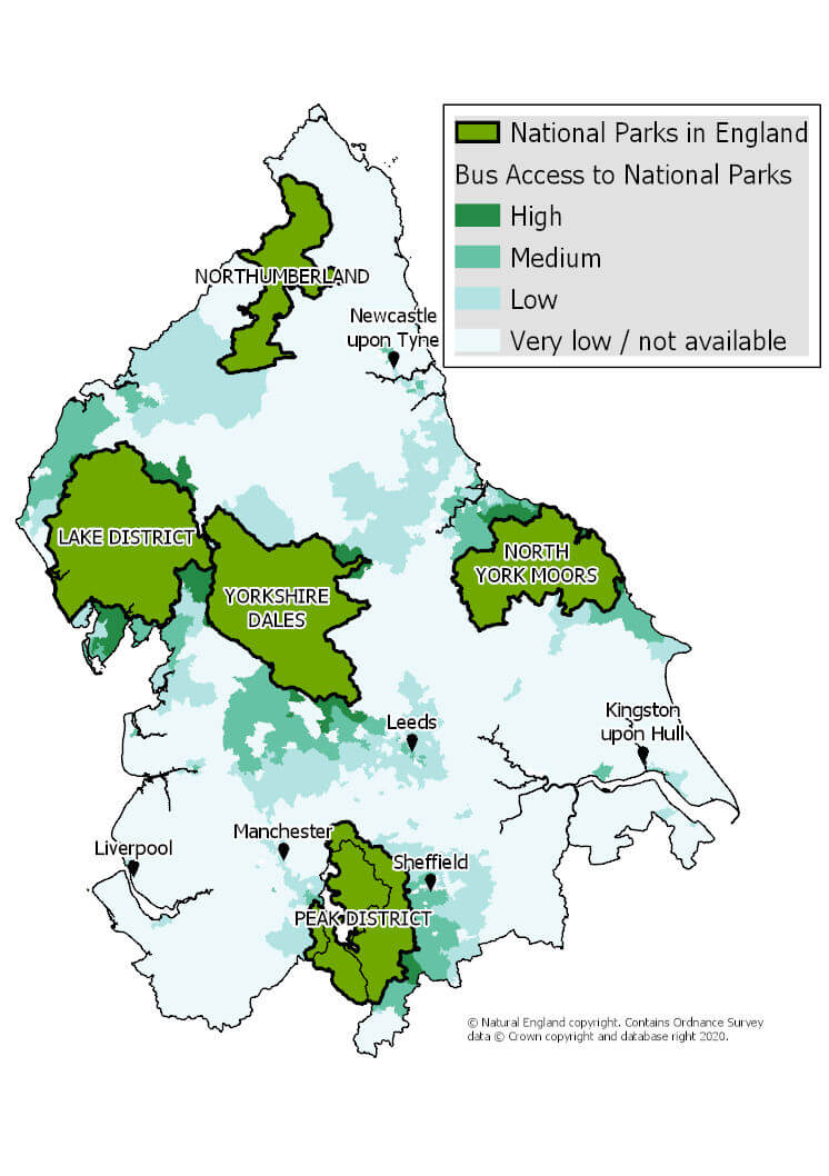
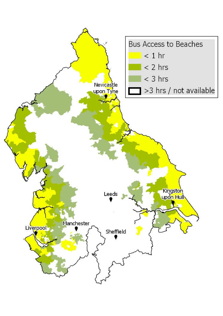
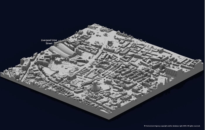
Here are some of our highlights from the mapping month:
